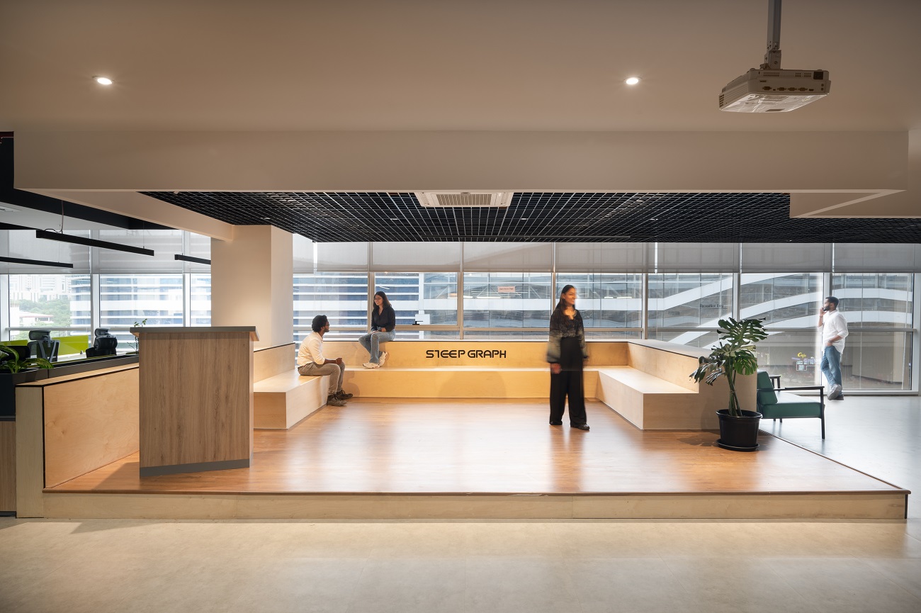
What immediately comes to mind when you think about a company’s brand identity? Ad campaigns, slogans, and logos are some of the first things that pop to mind. However, what about the actual place where a business carries out its everyday business? Although it may take time to come to mind, an office space’s design dramatically impacts how an organisation presents its brand.
This post will explore the fascinating field of office interior design and how it can effectively communicate the culture and values of a business.
Designing for Identity
An office space is like a canvas, waiting for the company’s brand to be painted. It takes more than just slapping the logo on the front desk to create a welcoming environment that embodies your business. An office should carefully consider which design elements, colour schemes, and layout best support the mission and values of the organisation.
For instance, a tech startup may opt for an open-plan office with bright, contemporary furniture to reflect its innovative and collaborative spirit. In contrast, a law firm might choose a more traditional, formal design to convey professionalism and trustworthiness. The design choices should evoke the right emotions and perceptions that resonate with the company’s brand.
Colour Psychology
Colour is a powerful tool in office design that evokes emotions and influences behaviour. Each colour has a unique psychological impact on individuals, and businesses can leverage this to reinforce their brand identity.
- Red: It symbolises energy and passion. Companies like Coca-Cola use red to convey excitement and enthusiasm.
- Blue: Blue represents trust and reliability. Tech giants like IBM and Facebook utilise shades of blue to convey stability and innovation.
- Green: It’s associated with nature and growth. Environmental companies and health-related organisations often use green to symbolise health and sustainability.
- Yellow: Yellow is linked to optimism and happiness. Brands like McDonald’s use this colour to create a friendly and inviting atmosphere.
Choosing the right colours can significantly impact how employees and visitors perceive your company. These colours should be used thoughtfully and harmoniously with the overall design to strengthen the connection between the space and the brand.
Layout and Flow
The layout of an office space is more than just desks and chairs; it’s about how people move through the space and interact with it. How an office is organised can reflect the company’s culture and values. For instance, a company that values collaboration may have open workstations, communal areas, and meeting spaces throughout the office.
On the other hand, a company that places a premium on individual work and focus may have more private offices and secluded workspaces. The flow of the office should facilitate the company’s desired work culture. An open, flexible layout can foster collaboration and innovation, while a more structured layout can convey a sense of order and discipline.
Incorporating Brand Symbols
Beyond colours and layout, integrating brand symbols and icons into the office design is another powerful way to reinforce your company’s identity. These symbols could be the company logo, mission statement, or quotes from the company’s founder. Imagine walking into an office and seeing a large, striking mural that depicts the company’s history and core values.
It creates a strong visual impact and reminds employees of the organisation’s heritage and aspirations. Similarly, brand symbols can be incorporated into the furniture, wall art, or even in the architectural elements of the space. It not only personalities the office but also fosters employees’ sense of belonging and purpose.
Lighting as an Expression of Brand
Lighting, often an overlooked aspect of office Interior design, can be crucial in reflecting a company’s identity. How a space is lit can influence the mood and ambience, which, in turn, affects the brand’s perception. For instance, a well-lit office with abundant natural light can convey transparency and openness. It suggests that the company has nothing to hide and operates with integrity.
On the other hand, softer, warm lighting can create a more relaxed and creative atmosphere, which might be perfect for a design agency. Incorporating the company’s colours in the lighting design can reinforce the brand. Imagine a technology company with a sleek, modern office bathed in blue and white LED lighting to create a futuristic, cutting-edge look.
Balancing natural and artificial light is essential. Natural light has been associated with lower energy expenditures, more productivity, and better well-being. Using large windows, skylights, and well-placed glass walls can all contribute to maximising natural light. On the other hand, energy-efficient artificial lighting can supplement and enhance the workspace, especially during dark hours.
Studio AsA: Shaping Brand Identity Through Design
When it comes to creating office spaces that truly reflect a company’s identity, Studio AsA is a name that stands out. They provide interior design services for co-working, commercial, and office environments. Studio AsA takes pleasure in taking a company’s brand identity and turning it into an attractive, well-thought-out, and efficient workspace. You can create an office environment that reinforces your company’s identity, values, and culture through thoughtful design choices, colour psychology, layout, brand symbols, and lighting. So, the next time you step into an office, take a moment to see beyond the furniture and walls – you might discover a company’s true identity shining through its workspace.


YOUR COMMENT